A
banner is a
flag or other piece of cloth bearing a symbol, logo, slogan or other message. A flag whose design is the same as the shield in a
coat of arms(but usually in a square or rectangular shape) is called a
banner of arms.
Banner-making is an ancient craft. Church banners commonly portray the saint to whom the church is dedicated.
The word derives from French word "bannière" and
late Latin bandum, a cloth out of which a flag is made (
Latin:
banderia,
Italian:
bandiera,
Portuguese:
bandeira,
Spanish:
bandera). The
German language developed the word to mean an official
edict or proclamation and since such written orders often prohibited some form of human activity,
bandum assumed the meaning of a ban, control, interdict or excommunication.
Banns has the same origin meaning an official proclamation, and
abandon means to change loyalty or disobey orders, semantically "to leave the cloth or flag".
example of banner and the format that been use in making the banner
billboard
A
billboard (sometimes also called a
hoarding in the UK and many other parts of the world) is a large
outdoor advertising structure (a
billing board), typically found in high-traffic areas such as alongside busy roads. Billboards present large
advertisements to passing pedestrians and drivers.
Typically showing large, ostensibly witty
slogans, and distinctive visuals, billboards are highly visible in the top
designated market areas. Bulletins are the largest standard-size billboards. Located primarily on major highways, expressways or principal arterials, they command high-density consumer exposure (mostly to vehicular traffic). Bulletins afford greatest visibility due not only to their size, but because they allow creative "customizing" through extensions and embellishments.
Posters are the other common form of billboard advertising, located mostly along primary and secondary arterial roads. Posters are a smaller format than bulletins and are viewed principally by residents and commuter traffic, with some pedestrian exposure.
the example of billboard and format to make billboard
branding
The meaning of many terms used in this field - "branding", "corporate identity", "corporate design" - varies wildly between industries and countries.
meaning a set of visual guidelines reflecting a company's outward appearance in all media. It includes, but is not limited to
- The Logo
- The colour palette used
- Fonts and their use
- Spacing, proportion and layout guidelines
With the main goal of maintaining a consistent and recognizable appearance. I think this is what you mean when asking about the difference between a logo and a branding.
A design manual will define these guidelines, often in the form of an actual, printed manual, with positive and negative examples.
However, the use of this vocabulary will vary, and this purist view is not shared by large parts of the industry :) As you can see in the examples linked below, "brand" and "visual identity" are used anonymously. If you want to get the term right before, say, giving a presentation, ask somebody familiar with your specific field first!
Good examples of design Manuals to look at - these show well that no matter what you call it, corporate design goes far beyond the logo:
example of brand and it format
book design
Book design is the art of incorporating the content,
style,
format,
design, and sequence of the various components of a
book into a coherent whole.
In the words of
Jan Tschichold, book design, "though largely forgotten today, methods and rules upon which it is impossible to improve, have been developed over centuries. To produce perfect books, these rules have to be brought back to life and applied."
[1] Richard Hendel describes book design as "an arcane subject", and refers to the need for a context to understand what that means.
[2]
example of book design
brochures
The most common types of single-sheet brochures are the bi-fold (a single sheet printed on both sides and folded into halves) and the tri-fold (the same, but folded into thirds). A bi-fold brochure results in four panels (two panels on each side), while a tri-fold results in six panels (three panels on each side).
Other
folder arrangements are possible: the accordion or "z-fold" method, the "c-fold" method, etc. Larger sheets, such as those with detailed maps or expansive photo spreads, are folded into four, five, or six panels. When two card fascia are affixed to the outer panels of the z-folded brochure, it is commonly known as a "z-card".
advertisment
Advertising in
business[citation needed] is a form of
marketing communication used to encourage, persuade, or manipulate an
audience (viewers, readers or listeners; sometimes a specific group) to take or continue to take some action. Most commonly, the desired result is to drive consumer behavior with respect to a commercial offering, although political and ideological advertising is also common. This type of work belongs to a category called
affective labor.
In Latin, ad vertere means "to turn toward".
[1] The purpose of advertising may also be to reassure employees or shareholders that a company is viable or successful. Advertising messages are usually paid for by
sponsors and viewed via various
old media; including mass media such as newspaper, magazines, television advertisement, radio advertisement,
outdoor advertising or
direct mail; or
new mediasuch as blogs, websites or text messages.
poster
A
poster is any piece of printed paper designed to be attached to a wall or vertical surface.
[1] Typically posters include both
textual and
graphic elements, although a poster may be either wholly graphical or wholly text. Posters are designed to be both eye-catching and informative. Posters may be used for many purposes. They are a frequent tool of advertisers (particularly of events, musicians and films),
propagandists,
protestors and other groups trying to communicate a message. Posters are also used for reproductions of artwork, particularly famous works, and are generally low-cost compared to original artwork.
greeting card
A
greeting card is an illustrated, folded card featuring an expression of friendship or other sentiment. Although greeting cards are usually given on special occasions such as
birthdays,
Christmas or other
holidays, they are also sent to convey thanks or express other feeling. Greeting cards, usually packaged with an
envelope, come in a variety of styles. There are both mass-produced as well as handmade versions that are distributed by hundreds of companies large and small. While typically inexpensive, more elaborate cards with die-cuts or glued-on decorations may be more expensive.
In Western countries and increasingly in other societies, many people traditionally mail seasonally themed cards to their friends and relatives in December. Many service businesses also send cards to their customers in this season, usually with a universally acceptable non-religious message such as "happy holidays" or "season's greetings".
The
Greeting Card Association is an international
trade organization representing the interests of greeting card and stationery manufacturers. John Beeder, former president of the Greeting Card Association, says greeting cards are effective tools to communicate important feelings to people you care about: "Anyone feels great when they receive an unexpected card in the mail. For me, there’s nothing like a greeting card to send a special message. I’m proud to be a part of an industry that not only keeps people connected, but uses both imagery and the power of words to help us express our emotions.”
ELEMENT OF GRAPHIC DESIGN
SHAPE
A shape is one of the seven element of art. When defining it within the study of art, shape is anenclosed space, the boundaries of which are defined by other elements of art (i.e.: lines, colors, values, textures, etc.).
Shapes are limited to two dimensions: length and width. Geometric shapes -- circles, rectangles, squares, triangles and so on -- have the clear edges one achieves when using tools to create them. Organic shapes have natural, less well-defined edges (think: an amoeba, or a cloud).
LINE
Line is one of the seven element of art. It is considered by most to be the most basic element of art..
In terms of art, line is considered to be a moving dot. It has an endless number of uses in the creation of art.
Line can also create the illusion of form in a drawing. Line quality is the thickness or thinness of a line. By varying the line quality an artist can show form in a drawing with just the use of line.
Line can also indicate shadow and form through the use of cross, counter and line Cross contour lines follow the contours of the object. Much like running your finger around the form of an object.
Line- element of art. In terms of art, line can be described as a moving dot. Line is perhaps the most basic element of drawing.
Kinds of lines
Vertical lines- lines that move up and down without any slant
Vertical lines- lines that move up and down without any slant
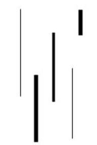 Horizontal lines-
 lines that are parallel to the horizon
 Diagonal lines-
 lines that slant
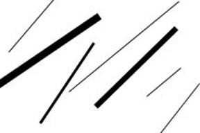 Zigzag lines-
 lines made from a combination of diagonal lines
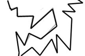 Curved lines-
 Lines that change direction gradually

Line Variation- adding interest to your lines is important in creating successful artwork
Length- lines can be long or short
Width- lines can be wide or skinny
Texture- lines can be rough or smooth
Direction- lines can move in any direction
Degree of curve- lines can curve gradually or not at all
Line quality or line weight- refers to the thickness or thinness of a line. By varying the line quality artists can make objects appear more 3-Deminsional and more interesting
Hatching and crosshatching- using lines to create value
Hatching- lines going in the same direction
Crosshatching- lines that cross
COLOR
(noun) - Color is the element of art that is produced when light, striking an object, is reflected back to the eye.
There are three (3) properties to color. First is hue, which simply means the name we give to a color (red, yellow, blue, etc.).
The second property is intensity, which refers to the strength and vividness of the color. For example, we may describe the color blue as "royal" (bright, rich, vibrant) or "dull" (grayed).
The third and final property of color is its value, meaning its lightness or darkness. The terms shade and tint are in reference to value changes in colors.
-Color has two models. CMYK and RGB
AN EXAMPLE OF COLOR USE IN ART
TYPE
Typography is the design and use of typefaces as a means of communication. It is considered to have begun with Gutenberg and the development of moveable type. But typography has its roots in handwritten letter forms. Typography encompasses everything from calligraphy through digital type and type on Web pages. It also includes type designers who create new letter forms as well as designers and calligraphers who use the letters as part of their designs.
IMPORTANT FOR BANNER AND POSTER
VERY IMPORTANT FOR MOVIE POSTER
ARTS, PHOTO AND ILLUSTRATOR
The important of art,photo and illustrator in design is to attract audience and give an impression for them. it very important for an company to succeed , and through it also it produce something interesting for audience.
photo and artwork
artwork illustrator
photography in art


.jpg)

.jpg)


.jpg)