Thursday, 14 August 2014

graphic design artist

David Carson


David Carson (born September 8, 1954) is an American graphic designerart director and surfer. He is best known for his innovative magazine design, and use of experimental typography. He was the art director for the magazine Ray Gun, in which he employed much of the typographic and layout style for which he is known. In particular, his widely imitated aesthetic defined the so-called "grunge typography" era
Carson graduated with “honors and distinction” from San Diego state university, where he received a BFA degree in sociology. A former professional surfer, he was ranked #9 in the world during his college days. Numerous groups including the New York Type Directors Club, American Center for Design and I.D. magazine have recognized his studio’s work with a wide range of clients in both the business and arts worlds. Carson and his work have been featured in over 180 magazine and newspaper articles around the world, including a feature in Newsweek magazine, and a front page article in the new york times . London-based Creative Review magazine dubbed Carson “Art Director of the Era.” The American Center for Design (Chicago) called his work on Ray Gun magazine “the most important work coming out of America.” His work on Beach Culture magazine won “Best Overall Design” and “Cover of the Year” from the Society of Publication Designers in New York.

Carson’s first book, with Lewis Blackwell, The End of Print, (forward by David Byrne) is the top selling graphic design book of all time, selling over 200,000 copies, and printed in 5 different languages.The work featured in The End of Print is the subject of various one-man exhibitions throughout Europe and Latin America,Asia and australia. Carson’s other titles include 2nd Sight, Fotografiks (with design historian Philip Meggs). He has two recently released books, TREK and The Book of Probes with Marshall McLuhan. David is also art director for the Mcluhan estate(“the medium is the message”).

Carson lectures extensively throughout the world, as well as at colleges throughout the U.S., including Cranbrook, ART center, Notre dame, RISD and Cal Arts. he has had numerous one man exhibitions of his work worldwide, and has spoken at over 100professional symposiums, including “Designer As Editor” at the Design Institute in Amsterdam. He teaches a week long workshop at the school of visual arts in nyc each summer.

The International Center for Photography (NY) singled out Carson as the “Designer of the Year” for his use of photography and design. Print Magazine proclaimed his work “Brilliant,” while USA Today described it as “visually stunning,” adding that his design of Ray Gun Magazine “may actually get young people reading again.”

Typography, a title published by Graphics magazine (NY), lists Carson as a “Master of Typography.” I.D. magazine chose Carson for their list of “America’s most innovative designers”. A feature in Newsweek magazine said of Carson “he changed the public face of graphic design”. The graphic design publication Emigre devoted an entire issue to Carson, the only American designer to be so honored in the magazine’s history. And in April 2004, London based creative review magazine calls David, “the most famous graphic designer on the planet”. David recently picked up 4 gold awards at the Charleston ADDY awards, including a “special judges award” for “professionalism”.

In the past few years, Carson has branched out into film and television to direct commercials and videos. He directed the launch commercials for Lucent technologies and teamed up with william burroughs in Carson’s short film, “The End of Print”. He also collaborated with Harvard Business School professor John Kao on a documentary entitled “The Art and Discipline of Creativity.” David designed the worldwide branding campaign for Microsoft, as well as the worldwide advertising for Giorgio Armani (Milan). He has appeared in advertisements endorsing Apple Computers, Samsung monitors and various paper companies. Carson has art directed and designed Surfer, Tw Skateboarding, Tw Snowboarding, Beach Culture, and Ray Gun magazines. He has an extensive list of international clients: Nine Inch nails, Toyota, Mercedes benz, Bank of Montreal, Microsoft, Quicksilver, Meg Ryan, David Byrne, Bush, Pepsi, and Xerox.

David is featured in both “The History of Graphic Design” by Philip Meggs, as well as”The Encyclopedia of Surfing” by Matt Warsaw.

He designed a special issue of Surfing Magazine titled “Explorations” which came out in july of ’04. He also recently directed a television commercial for the progressive UMPQUA Bank in Seattle, Washington.


David’s work continues to be subjective and largely driven by intuition, with an emphasis on reading material before designing it, and experimenting with ways to communicate in a variety of mediums. Carson remains a hands on designer, keeping his studio small and mobile.

David Carson art work


Shukor Yahya


About Shukor Yahya
Shukor Yahya is a Contemporary Artist and a Graphic Designer with 35 years of experience in Graphic designing and painting. His first degree is a Bachelor in Graphic Design from University Teknologi MARA (1976).After his graduation he was attached to McCann Erickson as a visualizer and a JuniorArt Director. Then he joined Idris Associates before being snapped up by WingsCreative Consultants, which was later bought over by BBDO International. Therehe worked with Tan Sri Lim Kok Wing as an art Director until 1984. He was also a Creative Director at Merit Design Consultants, Kuala Lumpur. In 1988 the Rotatry Club International sponsored him to stay in Melbourne as an Artist in Residence at Raja Azhar Gallery at Franklin Street, Melbourne, where he hold two solo exhibitions. Thus gave him a fruitful sabatical.From 1989-1998 he was the head of Packaging Design unit at Bates Asia.When he left advertising he went to pursue his post graduate study and earned hisMaster (MA) of Art and Design Education from DeMontfort University, Leicester, the UK in 2002.After graduated he taught at the department of Media Study, Faculty of SocialScience, University of Malaya until 2004. He had travelled in many countries includingSingapore, Thailand, Indonesia, Australia, India, Bangladesh, South Africa, Greece,United Arab Emirates, Saudi Arabia, England, Wales, the USA and Switzerland. When he started painting seriously he revived the art of Kufi square and quickly earned a reputationfor his unique approach in painting. Because of his individuality in style many art enthusiasts are mesmerized by what he had produced. Beginning 2010 he has signed a five years agreement signifying his partnership with CARAN d'ACHE based in Geneva, Switzerland.I refuse to repeat the works of the old masters as we're already having a stalemate in introducing a new art movement these days.So, here i am creating something new and contemporary and modern appealing to many walks of life. Less
Education:
Shukor Yahya obtained a Master of Arts in Art and Design Education degree from De Montfort University, Leicester, UK. and he has participated in many group and solo exhibitions locally and oversea.
Events:
Eastern Art Price 
Park Lane Hotel, Piccadilly, London.
March, 2010.

Baselworld, Switzerland.
 
18-25th March, 2010.

Kuala Lumpur Convention Center, World Islamic Economic Forum (WIEF),
 
18 -
19th May, 2010.

Psyche of Art @ Rain Forest, Kuala Lumpur. 
4th- 19th July, 2010.

Salon du Livre Ancien at Paris, France 
28th of April to the 12th May, 2011.


Shukor Yahya artwork


Faezal Muniran


Faezal Muniran was born in Kuala Lumpur, Malaysia in 1978. He studied graphic design and illustration before exploring digital media for his postgraduate study. During daytime he is a lecturer in Universiti Teknologi MARA specializing in new media, comics and illustration. While at night he is indulging himself as comic artist working on his personal and commissioned project. In 2007, he won a grant in the Digital Comic Competition for his comic project ‘The Time Mission’ and in January 2008 he was one of the winners in the Cerita Rakyat Malaysia (Malaysian Folklore) Creative Competition with his character design for ‘Si Bongkok and the Warriors of Tanjung Puteri’ organized by MSC and MDEC Malaysia. He is currently finishing his graphic novel and digital comic for ‘The Time Mission Vol. 1’ and a children’s sci-fi and fantasy e-comic adventure entitled ‘Dunia Asing’. He is also researching on how comics and graphic novels can help with reading literacy among school children in Malaysia.


PieR Gajewski was born on the 13th November 1976 in France.
He graduated from the Ecole Supérieure de l’Image (Comics Art School of Angoulême – France) and was in residency at the Author’s House of Angoulême for 2 years. He loves to draw and to think about different ways to make comics. He took part to many international comics book (as Comic Book Artist – Tribute to Will Eisner (USA), Sturgeon White Moss (UK)) and keeps on questioning the comics media via his graphical poems. For some months he has been illustrating articles for the French press and he’s currently working on an exhibition of drawings and photos of cities with Carole Sionnet.

Art Work By faezal Muniran and Pier Gajewski


Wednesday, 13 August 2014

basic graphic design

The History Of Graphic Design
    

As a manifestation of human culture, the Graphic Design has played a primordial role in the history of man as a social being. Many hundreds of graphic designs of animals by the primitive people in the Chauvet Cave, in the south of France, which weredrawn more than 30,000 B.C., the image of "Spotted Horses" ; painted by woman artists inside France's Pech Merle cave dated 23,000 BC, as well as similar designs in the Lascaux cave of France that were drawn more than 14,000 B.C. , the Altamira cave paintings of bison between 9000 to 17000 BC, the designs of the primitive hunters in the Bhimbetka rock shelters in India that were drawn more than 7,000 B.C. , the Aboriginal Rock Art, in the Kakadu National Park of Australia, and many other rock or cave paintings in other parts of the world are apt testaments to the very long history of  graphic design,  a history that is shared among humanity.


}A good example of this art is observable on the paintings of Altamira, which are located in the deep recesses of caves in the mountains of Northern Spain, far out of the reach of the destructive forces of wind and water.

} As a result these paintings have been preserved rather intact from 9,000-17,000 B.C. In addition to these murals, Altamira is the only site of cave paintings in which tools, hearths and food remains also have been found. These signs shed light on the habitat, and living conditions of these prehistoric artists .

}Unlike the other similar caves in Europe and elsewhere, the Altamira caves show no signs of soot deposits, which perhaps suggest that the people at Altamira had slightly more advanced lighting technology emitting less smoke and soot than the torches and fat lamps which Paleolithic people are given credit for.

The Example of Format that been use in Graphic Design

Banner 

banner is a flag or other piece of cloth bearing a symbol, logo, slogan or other message. A flag whose design is the same as the shield in a coat of arms(but usually in a square or rectangular shape) is called a banner of arms.
Banner-making is an ancient craft. Church banners commonly portray the saint to whom the church is dedicated.
The word derives from French word "bannière" and late Latin bandum, a cloth out of which a flag is made (LatinbanderiaItalianbandieraPortuguese:bandeiraSpanishbandera). The German language developed the word to mean an official edict or proclamation and since such written orders often prohibited some form of human activity, bandum assumed the meaning of a ban, control, interdict or excommunication. Banns has the same origin meaning an official proclamation, and abandon means to change loyalty or disobey orders, semantically "to leave the cloth or flag".

example of banner and the format that been use in making the banner


billboard 

     A billboard (sometimes also called a hoarding in the UK and many other parts of the world) is a large outdoor advertising structure (a billing board), typically found in high-traffic areas such as alongside busy roads. Billboards present largeadvertisements to passing pedestrians and drivers.
       Typically showing large, ostensibly witty slogans, and distinctive visuals, billboards are highly visible in the top designated market areas. Bulletins are the largest standard-size billboards. Located primarily on major highways, expressways or principal arterials, they command high-density consumer exposure (mostly to vehicular traffic). Bulletins afford greatest visibility due not only to their size, but because they allow creative "customizing" through extensions and embellishments.
Posters are the other common form of billboard advertising, located mostly along primary and secondary arterial roads. Posters are a smaller format than bulletins and are viewed principally by residents and commuter traffic, with some pedestrian exposure.

the example of billboard and format to make billboard


branding
The meaning of many terms used in this field - "branding", "corporate identity", "corporate design" - varies wildly between industries and countries.
meaning a set of visual guidelines reflecting a company's outward appearance in all media. It includes, but is not limited to
  • The Logo
  • The colour palette used
  • Fonts and their use
  • Spacing, proportion and layout guidelines
With the main goal of maintaining a consistent and recognizable appearance. I think this is what you mean when asking about the difference between a logo and a branding.
A design manual will define these guidelines, often in the form of an actual, printed manual, with positive and negative examples.
However, the use of this vocabulary will vary, and this purist view is not shared by large parts of the industry :) As you can see in the examples linked below, "brand" and "visual identity" are used anonymously. If you want to get the term right before, say, giving a presentation, ask somebody familiar with your specific field first!
Good examples of design Manuals to look at - these show well that no matter what you call it, corporate design goes far beyond the logo:

example of brand and it format


book design
Book design is the art of incorporating the content, styleformatdesign, and sequence of the various components of abook into a coherent whole.
In the words of Jan Tschichold, book design, "though largely forgotten today, methods and rules upon which it is impossible to improve, have been developed over centuries. To produce perfect books, these rules have to be brought back to life and applied."[1] Richard Hendel describes book design as "an arcane subject", and refers to the need for a context to understand what that means.[2]

example of book design


brochures
brochure is a flyerpamphlet or leaflet that is used to pass information about something. Brochures are advertising pieces mainly used to introduce a company ororganization and inform about products and/or services to a target audience. Brochures are distributed by radio, handed personally or placed in brochure racks. They may be considered as grey literature. They are usually present near tourist attractions.[1]
The most common types of single-sheet brochures are the bi-fold (a single sheet printed on both sides and folded into halves) and the tri-fold (the same, but folded into thirds). A bi-fold brochure results in four panels (two panels on each side), while a tri-fold results in six panels (three panels on each side).
Other folder arrangements are possible: the accordion or "z-fold" method, the "c-fold" method, etc. Larger sheets, such as those with detailed maps or expansive photo spreads, are folded into four, five, or six panels. When two card fascia are affixed to the outer panels of the z-folded brochure, it is commonly known as a "z-card".


advertisment

Advertising in business[citation needed] is a form of marketing communication used to encourage, persuade, or manipulate an audience (viewers, readers or listeners; sometimes a specific group) to take or continue to take some action. Most commonly, the desired result is to drive consumer behavior with respect to a commercial offering, although political and ideological advertising is also common. This type of work belongs to a category called affective labor.
In Latin, ad vertere means "to turn toward".[1] The purpose of advertising may also be to reassure employees or shareholders that a company is viable or successful. Advertising messages are usually paid for by sponsors and viewed via various old media; including mass media such as newspaper, magazines, television advertisement, radio advertisement, outdoor advertising or direct mail; or new mediasuch as blogs, websites or text messages.


poster
poster is any piece of printed paper designed to be attached to a wall or vertical surface.[1] Typically posters include both textual and graphic elements, although a poster may be either wholly graphical or wholly text. Posters are designed to be both eye-catching and informative. Posters may be used for many purposes. They are a frequent tool of advertisers (particularly of events, musicians and films),propagandistsprotestors and other groups trying to communicate a message. Posters are also used for reproductions of artwork, particularly famous works, and are generally low-cost compared to original artwork.


greeting card
greeting card is an illustrated, folded card featuring an expression of friendship or other sentiment. Although greeting cards are usually given on special occasions such as birthdaysChristmas or other holidays, they are also sent to convey thanks or express other feeling. Greeting cards, usually packaged with an envelope, come in a variety of styles. There are both mass-produced as well as handmade versions that are distributed by hundreds of companies large and small. While typically inexpensive, more elaborate cards with die-cuts or glued-on decorations may be more expensive.
Hallmark Cards and American Greetings are the largest producers of greeting cards in the world.
In Western countries and increasingly in other societies, many people traditionally mail seasonally themed cards to their friends and relatives in December. Many service businesses also send cards to their customers in this season, usually with a universally acceptable non-religious message such as "happy holidays" or "season's greetings".
The Greeting Card Association is an international trade organization representing the interests of greeting card and stationery manufacturers. John Beeder, former president of the Greeting Card Association, says greeting cards are effective tools to communicate important feelings to people you care about: "Anyone feels great when they receive an unexpected card in the mail. For me, there’s nothing like a greeting card to send a special message. I’m proud to be a part of an industry that not only keeps people connected, but uses both imagery and the power of words to help us express our emotions.”


ELEMENT OF GRAPHIC DESIGN

SHAPE


       A shape is one of the seven element of art. When defining it within the study of art, shape is anenclosed space, the boundaries of which are defined by other elements of art (i.e.: lines, colors, values, textures, etc.).
Shapes are limited to two dimensions: length and width. Geometric shapes -- circles, rectangles, squares, triangles and so on -- have the clear edges one achieves when using tools to create them. Organic shapes have natural, less well-defined edges (think: an amoeba, or a cloud).

LINE


                    Line is one of the seven element of art.  It is considered by most to be the most basic element of art..

                   In terms of art, line is considered to be a moving dot.  It has an endless number of uses in the creation of art. 


                Line can also create the illusion of form in a drawing.  Line quality is the thickness or thinness of a line.  By varying the line quality an artist can show form in a drawing with just the use of line.

               Line can also indicate shadow and form through the use of cross, counter and line  Cross contour lines follow the contours of the object.  Much like running your finger around the form of an object.

              Line- element of art.  In terms of art, line can be described as a moving dot.  Line is perhaps the most basic element of drawing.
Kinds of lines
Vertical lines- lines that move up and down without any slant

Vertical lines- lines that move up and down without any slant
The Elements of Art- Line
Horizontal lines- lines that are parallel to the horizon
The Elements of Art- Line
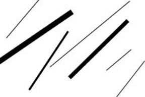
Diagonal lines- lines that slant
The Elements of Art- Line
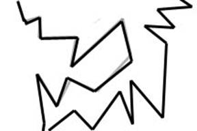
Zigzag lines- lines made from a combination of diagonal lines
The Elements of Art-Line

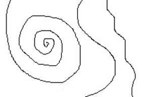
Curved lines- Lines that change direction gradually
            The Elements of Art-Line
Line Variation- adding interest to your lines is important in creating successful artwork
Length- lines can be long or short
    The Elements of Art- Line
    Width- lines can be wide or skinny
      The Elements of Art-line
      Texture- lines can be rough or smooth
        The Elements of Art- Line
        Direction- lines can move in any direction
        Degree of curve- lines can curve gradually or not at all
        Line quality or line weight- refers to the thickness or thinness of a line.  By varying the line quality artists can make objects appear more 3-Deminsional and more interesting
        Hatching and crosshatching- using lines to create value
        Hatching- lines going in the same direction
        Crosshatching- lines that cross

        COLOR

        (noun) - Color is the element of art that is produced when light, striking an object, is reflected back to the eye.
        There are three (3) properties to color. First is hue, which simply means the name we give to a color (red, yellow, blue, etc.).
        The second property is intensity, which refers to the strength and vividness of the color. For example, we may describe the color blue as "royal" (bright, rich, vibrant) or "dull" (grayed).
        The third and final property of color is its value, meaning its lightness or darkness. The terms shade and tint are in reference to value changes in colors.

        -Color has two models. CMYK and RGB


        AN EXAMPLE OF COLOR USE IN ART


        TYPE

                                           Typography is the design and use of typefaces as a means of communication. It is considered to have begun with Gutenberg and the development of moveable type. But typography has its roots in handwritten letter forms. Typography encompasses everything from calligraphy through digital type and type on Web pages. It also includes type designers who create new letter forms as well as designers and calligraphers who use the letters as part of their designs.


        IMPORTANT FOR BANNER AND POSTER


        VERY IMPORTANT FOR MOVIE POSTER


        ARTS, PHOTO AND ILLUSTRATOR


                        The important of art,photo and illustrator in design is to attract audience and give an impression for them. it very important for an company to succeed , and through it also it produce something interesting for audience. 

         photo and artwork


         artwork illustrator


        photography in art